Conveying the results of your work is all about telling the story your results are trying to tell. To tell a good story, you need to use effective visualizations. This article gives you five tips that will help you create more compelling visualizations, reinforcing the concept of how diversity and inclusion drives innovation and growth.
I think data visualisation is one of the overlooked technical skills in tech, which is as essential as the core technical aspects.
Regardless of which branch of tech you’re in, you will need to communicate your results and findings using some form of visualisation at some point. After all, data is a story told in numbers; visualising it is how you’re telling the story.
However, when we enter the tech field, we focus on learning how to code, the different algorithms, programming languages, libraries, and packages and overlook the visualisations and storytelling aspect of the field.
I am not saying learning all these aspects is not essential; instead, I am trying to emphasise that visualisation is as vital as these core technical skills.
Picture this; you spend hours cleaning, exploring, and modelling data. It’s interesting, but your data visualisation is boring and ineffective. Unfortunately, that leads to your audience overlooking your hard work.
Visualising your data effectively is like learning to tell a compelling story.
Your choice of chart type, colours, or style, will make a tremendous difference in how others perceive your findings.
This article will cover five tips to help you tell a compelling story with your data.
Tip №1: Simple is better
The goal of using visualisation is to make information easier to read and understand by others. So, having complex and busy visualisation is not what you want to use.
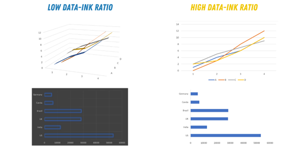
When creating a visualisation, pay attention to the data-ink ratio. Data-ink ratio is a term used to refer to the amount of data vs. redundant ink in the graph, such as background effects/ colours and 3D representation of the data.
Instead of using multi-dimensional graphs, you can use visualisation properties like shape, colour, and thickness to differentiate and distinguish your various findings.

- Photo by the author
Tip №2: Take your time with chart types
The type of chart you will use will differ based on your data. However, a good rule of thumb is:
- Categorical data can be described best using a bar chart with more than five categories or a pie chart otherwise.
- Nominal data can be described using bar charts or histograms if your data is discrete or line/ area charts if it is continuous.
- To show the relationship between different values, use a scatter plot, bubble chart, or line chart.
- To compare values, use a pie chart — for relative comparison — or bar charts — for precise comparison.
Tip №3: Only one aspect per chart
Before creating a chart, you need to decide what exactly you want to show. For example, do you want to show patterns or details? Try to display only one aspect at a time. It is better to deliver only one message per graph.
Use two different plots to show two sides of your data, a pattern, and some details that will allow others to understand your results faster. An example would be using a line chart to show details and a heatmap or horizon graph to show the pattern within the data.
Tip №4: Pay attention to axis ranges
The range of your vertical and horizontal axes depends on the chart type and the story you’re trying to tell.
For example, suppose you’re using a bar chart only to show the maximum values of different datasets. In that case, your axes need to start from 0.
However, suppose you want to show fluctuation in your data in precise numbers. In that case, you need to zoom in on your axes to clarify this fluctuation.
Tip №5: Emphasise change rate with data transformation
Using transformations in your graphs can change the impression and the information your chart is trying to convey. Generally speaking, you can transform two aspects of your graphs – your axes or your data itself.
Transforming your axes means deciding between logarithmic and linear axes. For example, a logarithmic scale is often used to display the percentage of change during a period. In contrast, a linear scale is used to display the absolute difference between various unique points of your dataset.
Another aspect that can be transformed is the data itself; for example, if you want to avoid using logarithmic axes, you can transform your data by displaying absolute values or normalising them to the mean or a specific value.

Visualising data is often the best and most straightforward approach to communicating this data to a broad audience. Therefore, whenever we try to create charts and figures, we need to make them simple, direct, and easy to read.
Remember, your data tells a story, and your visualisation choice can make this story exciting or downright boring.
The five simple tips in this article can quickly help you improve the quality and readability of your visualisation:
- Simple is always better.
- Your axes ranges make a huge difference.
- Focus on one aspect per chart.
- Choose the right chart type for your data.
- Use transformations to emphasise change.

Read More from Sara Metwalli


